

Visual Composer for WordPress is a lifesaver when it comes to web design these days. It makes designing page layouts a hundred times easier compared to writing code, and I’ve been using it for many years now. However it can be a real b**** at times, especially when moving between desktop to mobile.
A commonly-encountered problem is the Post Grid element showing one element per column, which most times looks pretty ridiculous:
 One column layout on Post Grid. Bloody annoying.
Yeah this looks pretty stupid, since there’s plenty of space to show two logos per column. Unfortunately there’s no such option in Post Grid, and all my life I had to deal with it.
Until now.
The solution
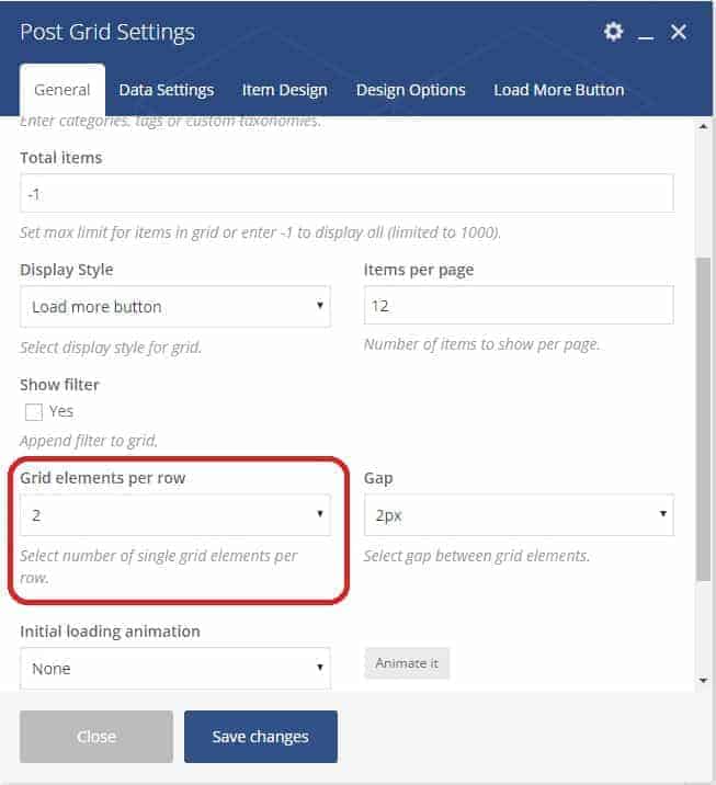
First, go to your Post Grid settings and check how many grid elements per row you are using.
Next, go to your Custom CSS page (I assume you have one in your Theme Options – else the Visual Composer Custom CSS page should do), and paste the below code:
@media only screen and (max-width: 479px) {

.vc_col-sm-6 {width: 50%; display:inline-block !important;}

}
The above code works with 2 grid elements per row, as per the picture. If you use more or fewer grid elements, replace the code accordingly:
6 grid elements = .vc_col-sm-2
4 grid elements = .vc_col-sm-3
3 grid elements = .vc_col-sm-4
2 grid elements = .vc_col-sm-6
1 grid element = .vc_col-sm-12
And of course, if you want to show more than 2 columns:
2 columns = 50%
3 columns = 33%
4 columns = 25%
5 columns = 20%
6 columns = 16.667%
 SO. MUCH. BETTER.
I hope this has helped you, and if you are having trouble with your code, do comment below and I’ll try my best to help. Disclaimer: I’m no programmer though, just another regular WP designer like the next guy. But I’ll try my best.
Good luck!


36 Responses
Hi Michael,
Thank you for this post, I have the same problem but can’t seem to fix it.
Also your code doesn’t seem to work.
Could you maybe help me out?
Hey sorry I missed this comment. Can you share your site/page where you’re having this problem?
hi
i whant to show two columns on Visual Composer (PF Item Grid AJAX) for mobile
Hi, yeah that’s the whole point of this post… did you try the steps I outlined, and where do you encounter any problems?
Hey Michael, does this same method work for image galleries? I haven’t been able to make 2 columns on mobile for image galleries.
Hmm that’s a different thing altogether – VC Image Galleries show only one image at a time, so you can’t just use CSS to show more. You could technically amend the code itself, but I find the easier way around is to just use a Carousel element instead, assuming that’s what you were going for. Does this help?
PS sorry for the late reply, I was on holiday last week 🙂
Just perfect! Thank you from Brazil!
Glad I could be of help! Have a great day 🙂
Nice! Almost 🙂 Unfortunately, seems as if it resizes it to smaller, but still not putting it on 2 columns only 1. Website: (and please remove the website url after you read it thanks) https://vasterbottenssapa.se
Hi Romeo! I don’t see the custom CSS firing on your .vc_col-sm-6 class – did you skip this part?
@media only screen and (max-width: 479px) {.vc_col-sm-6 {width: 50%; display:inline-block !important;}
}
Seems to have a possible conflict with your mobile settings – I see a vc_col_xs-12 firing in there somewhere. If I recall correctly I didn’t have any special mobile settings, but I’m not entirely sure, this post was written a few months back and I didn’t need to use it again till now so my memory’s a bit fuzzy.
👍 worked great!
Glad it helped!
hey, unfortunately with your code the filtering in data grid is not working in responsive mode. i have check it
Hey that’s unfortunate. You sure you followed all the steps? Which part isn’t working, send a link?
the css is working, but if you have filtering, then the filtering is not working in mobile devices
Hi!
I tried to do this om my media grid but it did’nt work. Do you know how I can fix it? I want at least two columns in mobile view.
Here is my page and you have to scroll to “Produktkategori” to see my images;
https://skyltar.se/produkter/forbudsmarken/
Hey, sorry for the late reply. It seems you’re using 6 grid items for your full desktop version and bringing it down to 2 columns in mobile, so your CSS should be:
@media only screen and (max-width: 479px) {
.vc_col-sm-2 {width: 50%; display:inline-block !important;}
}
I don’t see any custom CSS firing on your page specific to the above so did you follow those instructions? Remember to clear cache too.
Update: See screenshot here, once I added in the correct CSS the products show just fine, so this is most likely the problem, as best as I can see without admin access: https://snag.gy/XhSl8F.jpg
Hope this helps.
Hi!
I tried the CSS in Custom CSS and also in my in Visual Composer Media Grid but nothing happend 🙁
I tried again and it worsk fine! Thank you so much! <3
Glad it worked out!
check this demo http://flisvos.azurewebsites.net/ and you will understand, in small screen the filter of the grid is not working
Hey sorry for the late reply. It seems you managed to fix it? I’m seeing filters loading on 2 columns just fine: https://snag.gy/8Bm7NO.jpg
yes but the filtering is not functioning
Thanks very much. Looks perfect, but the only problem is that for some reason it does not work for me. Can you please check the site: http://www.apfelservice.at/reparatur-preise
Maybe the issue is that its not stock visual composer, but modified by uncode and the code needs to be a bit different? Thanks very much.
I changed the URL to: apfelservice.at/reparaturen/ not /reparatur-preise
Try changing the css code to
@media only screen and (max-width: 479px) {.col-half-gutter {width: 50%; display:inline-block !important; padding-top: 0px;}
}
In your case it’s because it’s a modified VC plugin so they used a different CSS class which naturally invalidated my code. You can also replace .col-half-gutter with .col-lg-3, see which works best for you. Hope this works!
Hi,
Thanks! Worked like a charm for normal grids but when using pagination it’s still scaling down.
Any ideas for this?
Share a link?
Hello, and do you maybe have an idea, how to display single images that are implemented in a row inline on mobile devices?
Best
Whoops I didn’t see this comment earlier. For those, just go to the Column settings and edit the Responsive tab.
hi doesnt work well with the masonry grid. some white space between posts. any idea how to fix it? attached image —> https://ibb.co/pnLJL06
Thanks
Hi
Thanks, it worked great on my Android phone, but not on my Iphone 8.
Could you maybe help me out?
Thank you:-)
Ellen
Hi again
It is working on Iphone 8 also now:-)
Ellen
I’m having the same problem as nik. The columns are shown now but the filter is not working. Any suggestion? Thank you.
Apologies I missed this comment. I’ve long moved on to Elementor for a few years now and highly recommend you do so as well. I’m surprised there are still people who use Visual Composer…